 Artinsider was an art based community originally conceived for animation and comic art. Working with world famous arists from Disney, Warner, Dark Horse, each artist was given his own section to display and sell art. Venture capital pushed towards more traditional artists, and the Company was sold to McGraw Publishing in 2001.
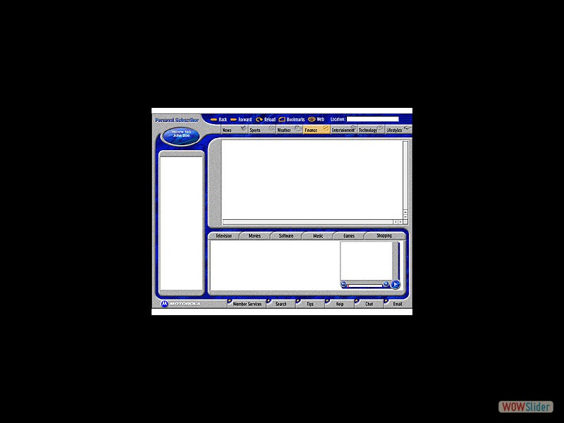
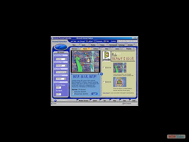
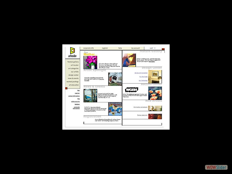 I designed 3 different websites as we added artists and honed the business model. This page still looks fresh and relevant today, using concepts that would soon become traditional a decade later.
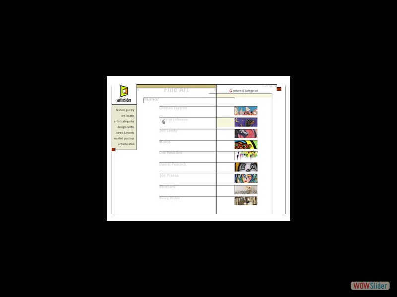 Each artist was given his own section for biography and art.
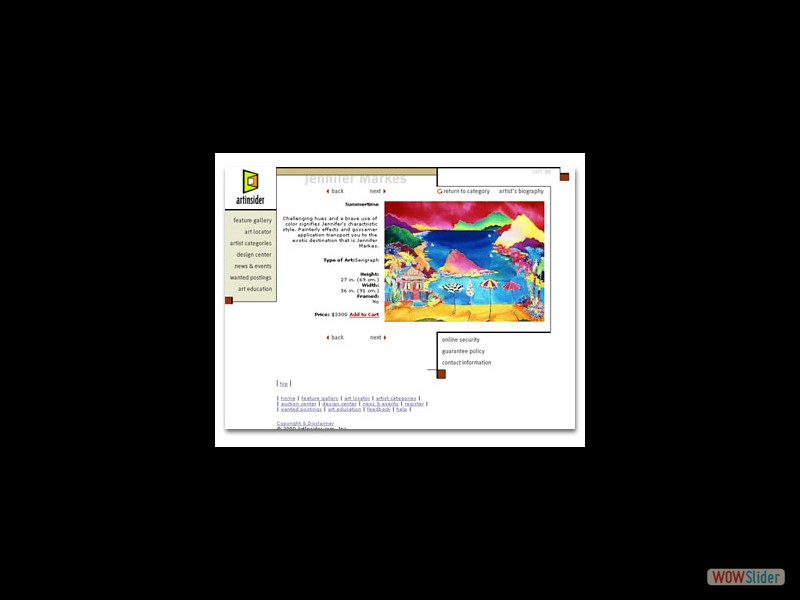 One of the Artinsider patents was for the ability for a user to color correct his monitor online. This is one of the sales pages, where a larger image could be chosen if desired.
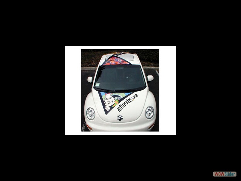 All the principals bought VW Beetles, I designed the wraps (still a new thing) using various artists.These were a hit in the valley.
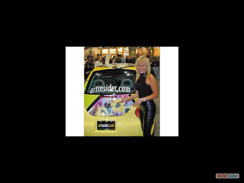 One of the cars was part of the trade show booth I designed at the New York Art Expo in 2000. Artinsider made a huge splash and was the first of its kind.
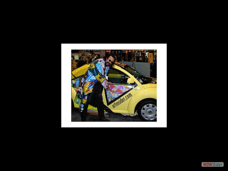 One artist not to be outdone.
 Interactive Public Relations was a 5 year old San Francisco firm. The identity developed for I.P.R. is made up of two planes coming together, representing IPR’s primary business focus which exists "where the Internet and Enterprise meet. It also serves as a graphic representation of the people behind Interactive Public Relations.
  I take full responsibility for creating probably the most copied and now cliched logo ever. In 1997 it was new and fresh. The 2 "swooshes" represent the 2 entities sharing data, while also creating a dynamic "S" form. This was an extremely successful campaign securing the funding for the inventors of email, and was used up until their acquisition.
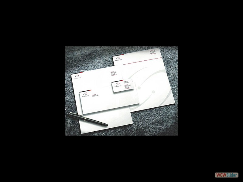 The Sendmail logo was used on everything printed by the company, and was even made into Christmas ornaments.
"Tony, your work rocks! Getting design work past the Sendmail crew is not an easy thing, but you did it. You met the need, hit the market and gave us great design that works for the company, product and market. You're a star! Keep it up." Richard Guth
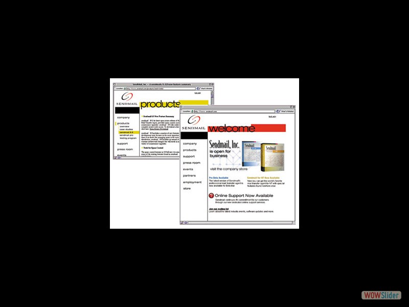 A website was designed to reflect the new look of the commercial end of the company.
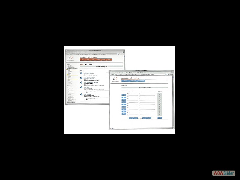 Although the open source lived on, I worked with the engineers to design a GUI for their incredibly robust and sometimes scary software. This was a smash hit and garnered rave reviews. Even somebody who was new to Sendmail could become a power user. This GUI remained with few changes for over a decade.
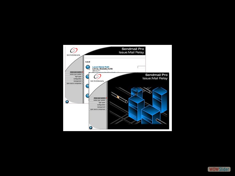 The online help for the GUI was extremely detailed, I developed animations for this as well as their sales demonstrations and trade show exhibits.
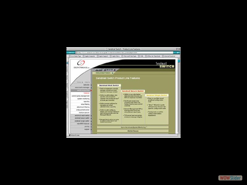 Web based walkthrough of software continuing overall theme of online help and demonstrations.
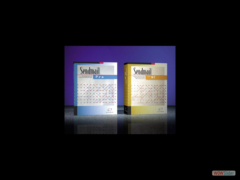 I also designed the packaging for the first version of their software, and art directed the Switch software they designed later. I continued working for Sendmail after leaving Profile/Cymbic, as well as their head of marketing on his new ventures.
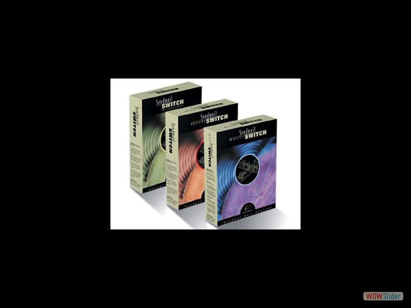 Software Packaging for Sendmail Switch software. This was the next step for the company as it was not simply a value added product carried over from their open source software. So a sophisticated and slick look that still conveyed the character of the rest of Sendmail's theme.
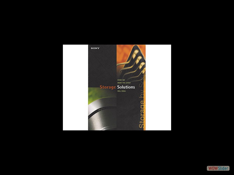 A series of collateral for Sony implementing close up heavily cropped photography and bold colors that helped offset the stodgy reputation Sony had with the tekkies.
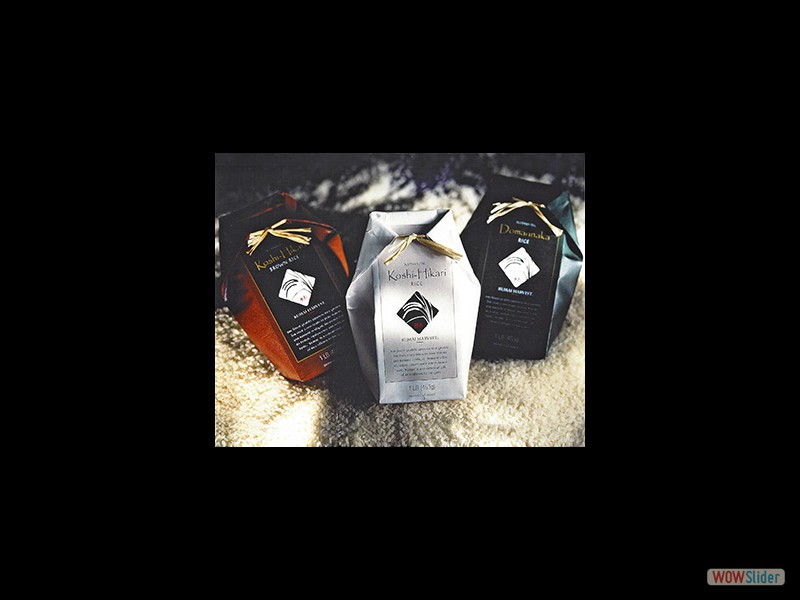 JA Zenchu was a Japanese Growers Cooperative founded in 1954. In an agreement with Williams Sonoma and promotion by Chef Mark Miller, they would import the high-end rice to the USA for the first time to be featured in the WS Grand Cuisine stores as a flagship item. I developed the logo for the growers and the kimono style packaging conveying the delicacy and care that went into this exquisite rice.
 The 4th Floor of (then) Wilson Sonsini & Goodrich was leaving, nobody knew it. The clients presented themselves as "Vincent Lan Group". After 2 unfruitful meetings I told them that we couldn't work together as their story wasn't matching the design goals. My partners were not happy. The following day they asked us to sign NDA agreements (first I'd seen!) and the rest is history. The acorn in wire frame represents growth and potential, the umbrella shape containing it nurturing and protection. They became the largest law firm in the valley within a year.
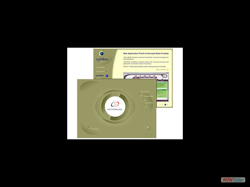 The Profile Design Spinoff that was created to leverage my multimedia and animation skills for the first dotcom explosion. This website was the first created with the broadband in mind, and dozens of articles were written about this, pros and cons. It was a Macromedia site of the day, and was admitted to permanent gallery status 1999, where it remained until some time after their acquisition by Adobe.
It was heavily organic in look and function, and freely moved and reconfigured itself. It made the desired impact and Cymbic grew to a staff of 30 people within a year once at their new Marin HQ. I continued working for them and their accout reps for years afterwards.
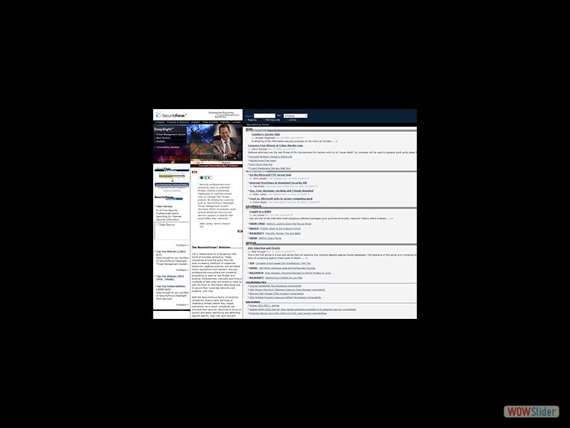 First website designed for Security Focus, as they moved from a simple portal to a sustainable business model. They were the go-to site for IT personel on the latest virus threats.
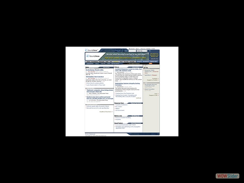 Second website design, moving away from the simple link layout originally implemented. The new website would now feature articles from industry leaders and was compartmetalized for easier navigation. I also designed their banners and virus alert animations. Security Focus was later acquired by Symantec.
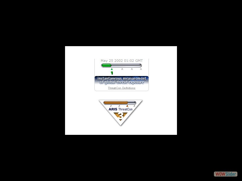 Among the banners and ads for Security Focus, the ARIS Threatcon "thermometer" was on the landing page front and center showing today's threat level. The triangular shield was animated and used to describe the levels of threats with examples on the Threatcon page.
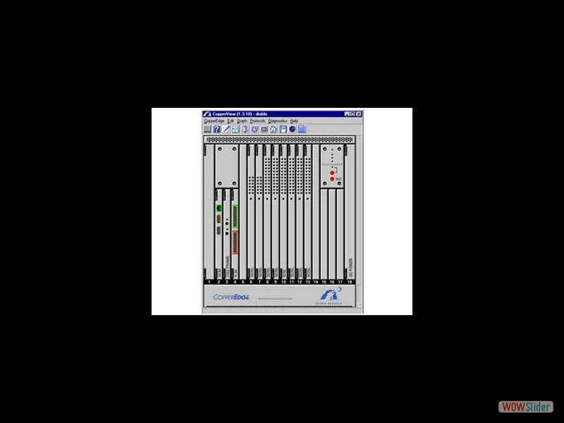 This software GUI was designed to show at a glance the configuration of every system within a network. You could easily check each device and configure it online without having to do a physical inspection.
 This was the first logo for Duovu, when there was no business model and all work was confidential.
 The current "Web 2.0" model, with a bigger, bolder, friendlier look. This was the one used at the official launch. It was meant to still be recognizable as the same company, as we had built some equity in it by this point.
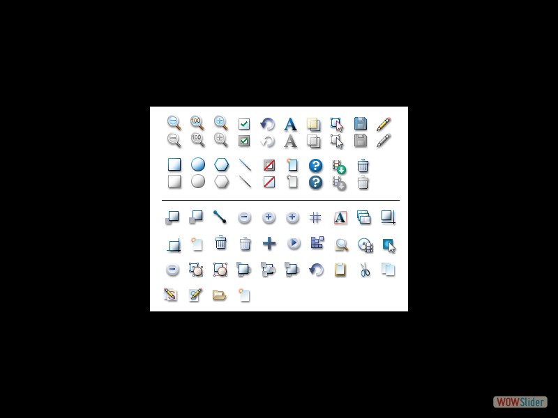 Duovu attempted several draw programs online, and I drew literally hundreds of icons in various sizes for this software as well as dozens of potential layouts. This is an example taken from 2 of the draw programs, one in JAVA and one in FLASH.
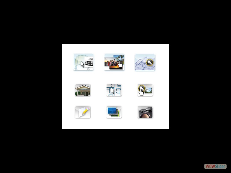 Once the company transitioned from Flash to HTML, a new set of icons was made that were no longer animated, but still had the rich photographic look of the flash site. These are a few examples.
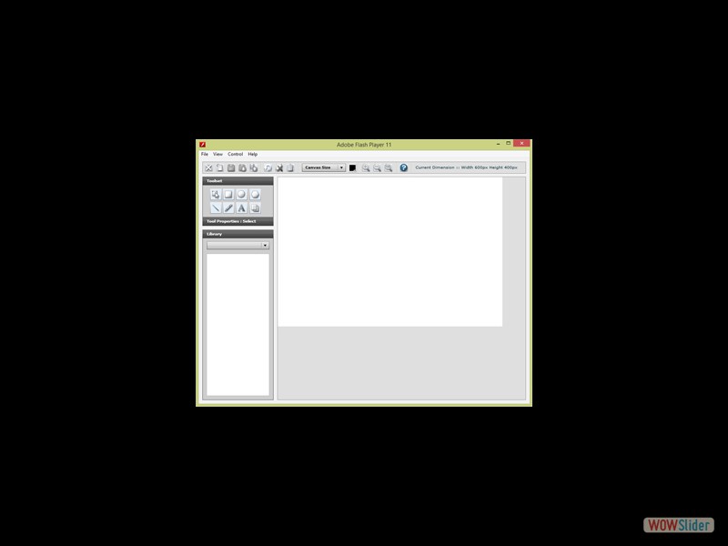 A draw program was developed in flash, with the ability for a user to import a drawing to trace over, as well as being supported by library objects such as stairs and furniture. I created the layout of this tool as well, and this is a screen capture of the working software.
 The first logo for Duovu, while everything was still confidential and there was no business model.
 As part of the proof of concept, layouts were made showing the functionality of most pages. Many of these required NDA's and were part of funding projects, this is one of the few I had to show.
cssslider by WOWSlider.com v8.7
 1
1 2
2 3
3 4
4 5
5 6
6 7
7 8
8 9
9 10
10 11
11 12
12 13
13 14
14 15
15 16
16 17
17 18
18 19
19 20
20 21
21 22
22 23
23 24
24 25
25 26
26 29
29 30
30 31
31